Q&A 6 How do you create an MA plot from DESeq2 results using R?
6.1 Explanation
An MA plot shows the relationship between:
- M (log ratio) = log2 fold change (Y-axis)
- A (mean average) = average expression (X-axis), often
baseMean
It helps you visualize:
- Genes with large fold changes
- Genes with low expression and unstable variance
- Potential systematic bias in your differential expression results
MA plots are especially useful after running DESeq2, as the result object includes baseMean and log2FoldChange.
6.2 R Code
library(tidyverse)

# 📄 Load DESeq2 results
res_df <- read_csv("data/deseq2_results.csv") |>
  drop_na(log2FoldChange, padj, baseMean)

# 📊 MA plot
ggplot(res_df, aes(x = log10(baseMean + 1), y = log2FoldChange)) +
  geom_point(alpha = 0.6, color = "steelblue", size = 2) +
  geom_hline(yintercept = c(-1, 1), linetype = "dashed", color = "darkgray") +
  labs(title = "MA Plot of Differential Expression",
       x = "Log10 Mean Expression (baseMean + 1)",
       y = "Log2 Fold Change") +
  theme_minimal()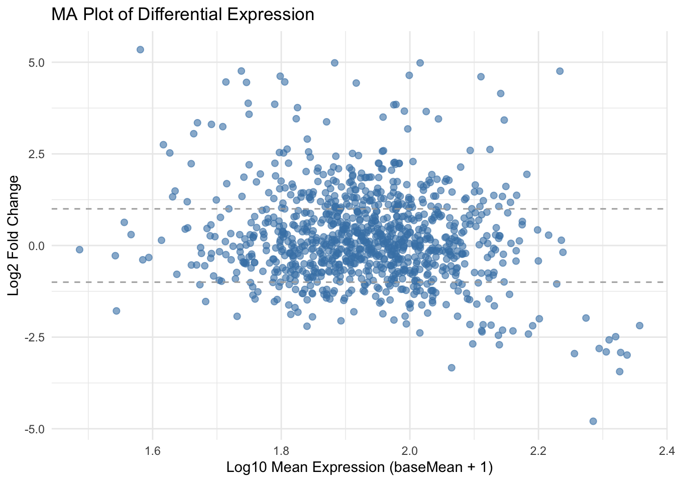
✅ Takeaway: MA plots offer a quick summary of how expression changes relate to average gene abundance, helping detect outliers and trends in your DE analysis.