Q&A 8 How do you create a heatmap of top differentially expressed genes using R?
8.1 Explanation
A heatmap allows you to visualize the expression patterns of the most differentially expressed genes across all samples. It is especially helpful for:
- Revealing sample clustering and gene expression trends
- Highlighting contrasts between conditions
- Identifying outlier samples or expression signatures
We typically use rlog-transformed data to ensure that variance is stabilized, making expression patterns more interpretable.
8.2 R Code
library(tidyverse)
library(pheatmap)

# 🔹 Load transformed expression matrix
rlog_mat <- read_csv("data/rlog_matrix.csv") |>
  column_to_rownames("gene") |>
  as.matrix()

# 🔹 Load DESeq2 results and select top 30 DE genes
res_df <- read_csv("data/deseq2_results.csv") |>
  drop_na(padj) |>
  arrange(padj)

top_genes <- res_df$gene[1:30]
top_mat <- rlog_mat[top_genes, ]

# 📊 Plot heatmap
pheatmap(top_mat,
         cluster_rows = TRUE,
         cluster_cols = TRUE,
         show_rownames = TRUE,
         fontsize_row = 6,
         scale = "row",
         main = "Heatmap of Top 30 Differentially Expressed Genes")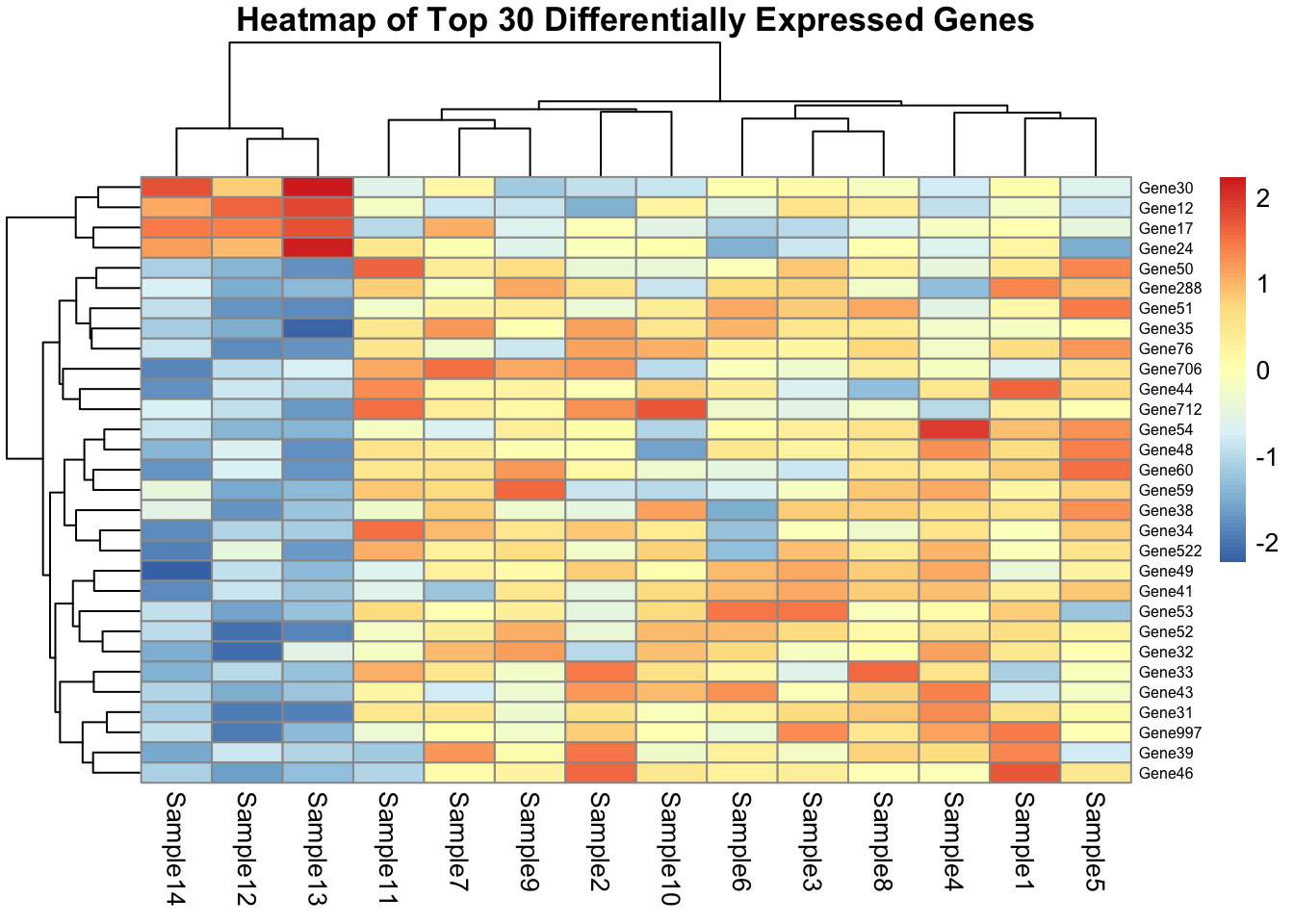
✅ Takeaway: Heatmaps are powerful tools to explore gene expression dynamics across conditions. Always use a variance-stabilized matrix and select top DE genes for clarity.