Q&A 5 How do you create a volcano plot from DESeq2 results using R?
5.1 Explanation
A volcano plot combines statistical significance with effect size to highlight genes of interest:
- X-axis: log2 fold change (magnitude of differential expression)
- Y-axis: -log10 adjusted p-value (statistical significance)
It’s ideal for identifying genes that are both strongly regulated and highly significant. DESeq2 results already contain log2FoldChange and padj columns, making this visualization straightforward.
5.2 R Code
library(tidyverse)

# 📄 Load DESeq2 results
res_df <- read_csv("data/deseq2_results.csv") |>
  drop_na(log2FoldChange, padj) |>
  mutate(significant = padj < 0.05 & abs(log2FoldChange) > 1)

# 📊 Volcano plot
ggplot(res_df, aes(x = log2FoldChange, y = -log10(padj), color = significant)) +
  geom_point(alpha = 0.6, size = 2) +
  scale_color_manual(values = c("FALSE" = "gray", "TRUE" = "red")) +
  geom_vline(xintercept = c(-1, 1), linetype = "dashed") +
  geom_hline(yintercept = -log10(0.05), linetype = "dashed") +
  labs(title = "Volcano Plot of Differential Expression",
       x = "Log2 Fold Change", y = "-Log10 Adjusted P-Value") +
  theme_minimal()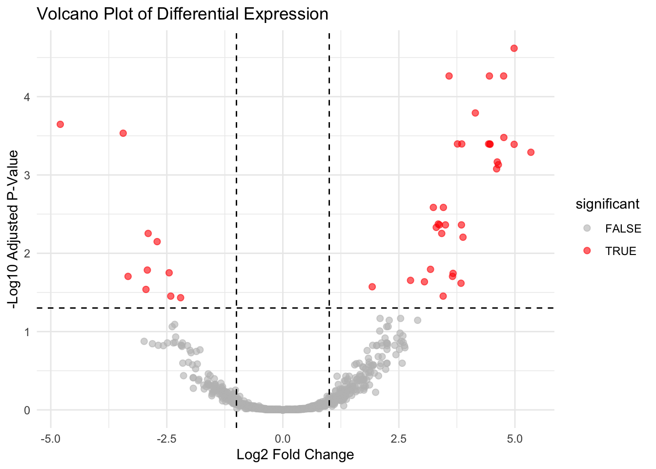
✅ Takeaway: Volcano plots help you visually prioritize genes for downstream validation by showing both statistical significance and magnitude of change.