counts <- readr::read_csv("data/demo-counts.csv", show_col_types = FALSE)

count_matrix <- as.matrix(counts[-1])Quantification and Count Matrix Concepts
What does a count represent?
Each entry in a bulk RNA-seq count matrix represents:
- The number of sequencing fragments aligned to a gene
- Aggregated across all reads mapping to that gene
- For a specific biological sample
Counts are integers because they represent discrete sequencing events.
They are not normalized values.
They are not expression levels.
They are raw sequencing depth measurements.
Load the count matrix
Why raw counts are not directly comparable
Two major factors affect counts:
Library size
Samples with more reads produce larger counts.Compositional effects
If a few genes are highly expressed, others appear relatively smaller.
This means raw counts cannot be compared directly across samples.
Inspect gene-level mean expression
gene_means <- rowMeans(count_matrix)

summary(gene_means)
Min. 1st Qu. Median Mean 3rd Qu. Max.
0.08333 10.16667 17.45833 21.67783 28.41667 98.66667 Inspect gene-level variance
gene_variances <- apply(count_matrix, 1, var)

summary(gene_variances)
Min. 1st Qu. Median Mean 3rd Qu. Max.
0.083 29.788 83.424 273.062 236.250 7399.720 Mean–variance relationship (raw scale)
RNA-seq counts typically show increasing variance with increasing mean.
mv_df <- tibble::tibble(
  mean = gene_means,
  variance = gene_variances
)

ggplot2::ggplot(mv_df, ggplot2::aes(x = mean, y = variance)) +
  ggplot2::geom_point(alpha = 0.3, color = "#036281") +
  ggplot2::scale_x_log10() +
  ggplot2::scale_y_log10() +
  ggplot2::labs(
    title = "Mean–Variance Relationship (Raw Counts)",
    x = "Mean (log scale)",
    y = "Variance (log scale)"
  ) +
  ggplot2::theme_light() +
  ggplot2::theme(
    plot.title = ggplot2::element_text(hjust = 0.5, face = "bold"),
    plot.subtitle = ggplot2::element_text(hjust = 0.5),
    panel.grid.minor = ggplot2::element_blank(),
    legend.position = "right"
  )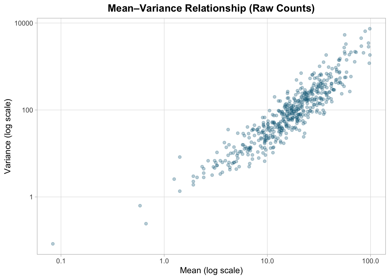
Variance increases systematically with mean expression, indicating heteroscedasticity typical of count data.
This violates the constant variance assumption of simple linear models.
Log transformation for comparison
log_matrix <- log2(count_matrix + 1)

log_means <- rowMeans(log_matrix)
log_vars  <- apply(log_matrix, 1, var)
log_mv_df <- tibble::tibble(
mean = log_means,
variance = log_vars
)
ggplot2::ggplot(log_mv_df, ggplot2::aes(x = mean, y = variance)) +
ggplot2::geom_point(alpha = 0.3, color = "#036281") +
ggplot2::labs(
title = "Mean–Variance Relationship (Log2 Transformed)",
x = "Mean (log2 scale)",
y = "Variance"
) +
ggplot2::theme_light() +
ggplot2::theme(
plot.title = ggplot2::element_text(hjust = 0.5, face = "bold"),
plot.subtitle = ggplot2::element_text(hjust = 0.5),
panel.grid.minor = ggplot2::element_blank(),
legend.position = "right"
)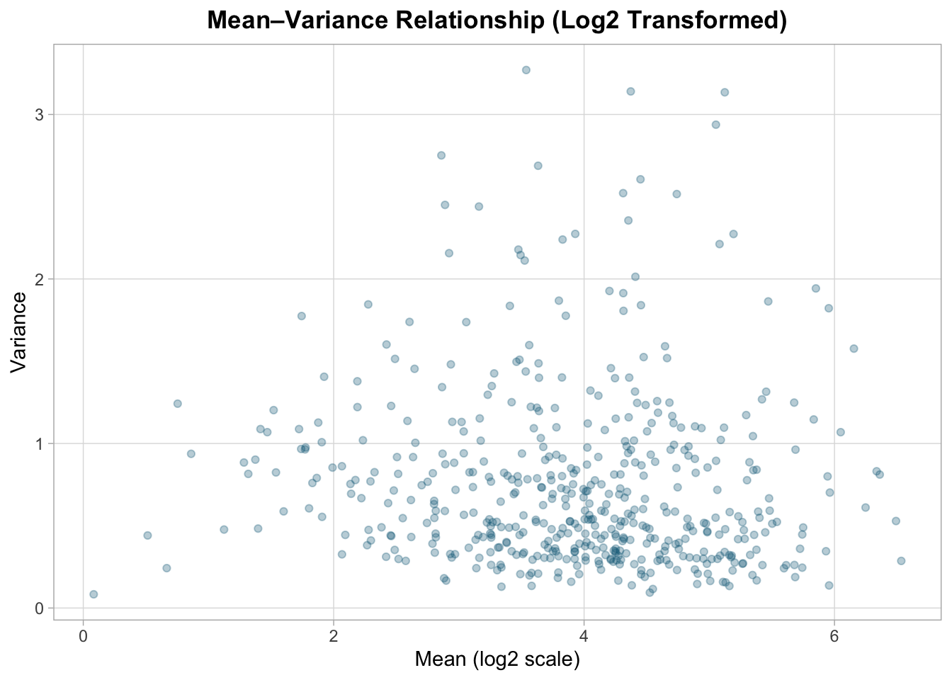
Log transformation compresses dynamic range and reduces heteroscedasticity, but it does not fully stabilize variance.
Why specialized models are used
RNA-seq data are:
- Discrete
- Overdispersed
- Mean-dependent in variance
This is why negative binomial models are commonly used in production RNA-seq workflows.
Full model fitting and dispersion estimation are covered in the premium edition.
Interpretation
From this lesson we learn:
- Counts reflect sequencing depth and composition
- Variance increases with mean
- Raw counts are unsuitable for direct comparison
- Transformation helps but does not replace proper modeling
In the next lesson, we introduce normalization and exploratory data analysis.